Combination Chart
Combination Chart is used for graphical representation when there is a significant difference between two dimension values. It features two axes: the primary axis and the secondary axis. Generally, the primary axis represents the larger quantity, while the secondary axis represents the smaller quantity. For example, when displaying GDP and GDP growth rate, the primary axis corresponds to GDP, while the secondary axis corresponds to GDP growth rate. SPSSAU supports:
Batch cluster charts for 'titles' (up to 5 items).
Customize chart styles.
Analyze up to 500 data samples.
Note:
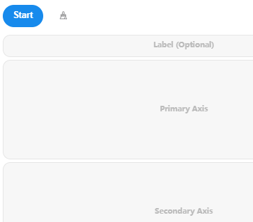
The 'Label Item' in the analysis panel is optional. If included, the corresponding 'label' will be displayed on the horizontal axis of the chart.
Data Format
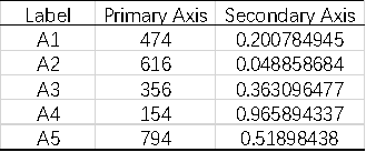
The data typically has large numbers on the primary axis (e.g., GDP), while the numbers on the secondary axis are much smaller (e.g., GDP growth rate).