Box Plot
Box Plot is a graphical tool used to display the characteristics of data distributions, particularly suitable for describing the central tendency and dispersion of data. SPSSAU supports:
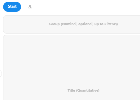
Batch analyze 'titles'.
Generate box plots with up to 2 grouping variables (e.g., gender, education).
Display specific outlier values and the count of outliers.
Calculation Steps
Box plots involve the calculation of five metrics: the minimum, the 25th percentile, the median, the 75th percentile, and the maximum, along with the criteria for identifying outliers, as follows:
- IQR: IQR = Q3 - Q1
- Minimum Value = Q1 - 1.5 × IQR
- Maximum Value = Q3 + 1.5 × IQR
- &nspb;
- Q1 represents the 25th percentile.
- Q3 represents the 75th percentile.
- IQR represents the interquartile range, which indicates the middle 50% range of the data.
Note:
The minimum value is not necessarily the smallest value, and the maximum value is not necessarily the largest value. The criteria for identifying outliers are as follows: values smaller than the minimum value or greater than the maximum value.
Data Format

The data includes two Categories and the analysis data (Categories can be omitted during analysis).